Monday
Friday
Metal and Gel Flower
Metal and Gel Flower
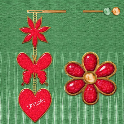
Make some fun elements for your scrap pages - Let's see what you can create!
Look at this tutorial to help you
Rhonda's Digital Designs

Make some fun elements for your scrap pages - Let's see what you can create!
Look at this tutorial to help you
Rhonda's Digital Designs
 Artist exploration, watercolour, creativity, inspirational, digital graphics, Journal Art, Scrapbooking, design, patterns, seasonal art, fun art,
Thursday
Digital Scrapbook Element Tutorial Needles
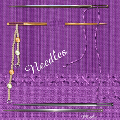
Above is my result of the needles elements made using the following tutorial.
Make some fun needles and threads using this tutorial as a guide
http://pspbuddies.com/pspTutor/CSGreen/needle/needle.html
See Shawna's tutorial to make thread here
http://pspbuddies.com/pspTutor/CSGreen/needle/needle.html
See Shawna's tutorial to make thread here
Labels:
Digital Art,
Needles,
Paintshop Pro,
Scrapbook Elements,
Tutorial
 Artist exploration, watercolour, creativity, inspirational, digital graphics, Journal Art, Scrapbooking, design, patterns, seasonal art, fun art,
Monday
Create a CD in Paintshop Pro XI
Create a CD in Paintshop Pro XI
©PCArt 22 September 2008
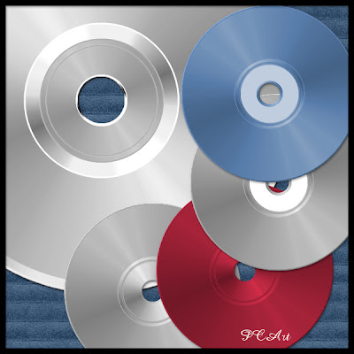
To create this representation of a CD you will need
the UnPlugged Tools - CD Shader - Plugin available HERE
Open New Canvas 13cm x 13cm
Transparent
300pixels per inch
Foreground / Background / Colour White
Preset Shapes Ellipse Vector and Anti-alias checked
Hold Shift Key down to maintain shape
Draw out a circle from top left corner of canvas to bottom right corner (to fit canvas)
Object Align Centre in Canvas
Convert to Raster
Selections Select All Float Defloat
Effects / Plugins / UnPlugged Tools / CD Shader
Selections Select None This will be your bottom layer.
Duplicate First Layer Resize 40% (all Layers Unchecked) This is your Second Layer
Duplicate Second Layer Resize 90% (all Layers Unchecked) This is your Third Layer
Duplicate Third Layer Resize 95% (all Layers Unchecked) This is your Fourth Layer
Go back to your Second Layer
Adjust Brightness 0 Contrast 41
Go to your Fourth layer
Adjust Brightness 0 Contrast 41
Go to your First layer
Select white centre with the magic wand and delete this area on all layers.
Go to your top layer and select inner circle with the magic wand
add a new layer fill selection with white and apply CD Shader
Selections Modify Contract by 12 and delete.
Merge Visible
Adjust Hue Saturation Lightness
Hue 243 Lightness 6 Saturation 0
Add Label or decorate or colorize.
Play around with brightness and contrast.
Experiment with your settings.
Hope you have fun with this easy tutorial.
PCArt
©PCArt 22 September 2008

To create this representation of a CD you will need
the UnPlugged Tools - CD Shader - Plugin available HERE
Open New Canvas 13cm x 13cm
Transparent
300pixels per inch
Foreground / Background / Colour White
Preset Shapes Ellipse Vector and Anti-alias checked
Hold Shift Key down to maintain shape
Draw out a circle from top left corner of canvas to bottom right corner (to fit canvas)
Object Align Centre in Canvas
Convert to Raster
Selections Select All Float Defloat
Effects / Plugins / UnPlugged Tools / CD Shader
Selections Select None This will be your bottom layer.
Duplicate First Layer Resize 40% (all Layers Unchecked) This is your Second Layer
Duplicate Second Layer Resize 90% (all Layers Unchecked) This is your Third Layer
Duplicate Third Layer Resize 95% (all Layers Unchecked) This is your Fourth Layer
Go back to your Second Layer
Adjust Brightness 0 Contrast 41
Go to your Fourth layer
Adjust Brightness 0 Contrast 41
Go to your First layer
Select white centre with the magic wand and delete this area on all layers.
Go to your top layer and select inner circle with the magic wand
add a new layer fill selection with white and apply CD Shader
Selections Modify Contract by 12 and delete.
Merge Visible
Adjust Hue Saturation Lightness
Hue 243 Lightness 6 Saturation 0
Add Label or decorate or colorize.
Play around with brightness and contrast.
Experiment with your settings.
Hope you have fun with this easy tutorial.
PCArt
Labels:
Compact Disc
 Artist exploration, watercolour, creativity, inspirational, digital graphics, Journal Art, Scrapbooking, design, patterns, seasonal art, fun art,
Thursday
Old Paper by Shawna
Old Paper by Shawna
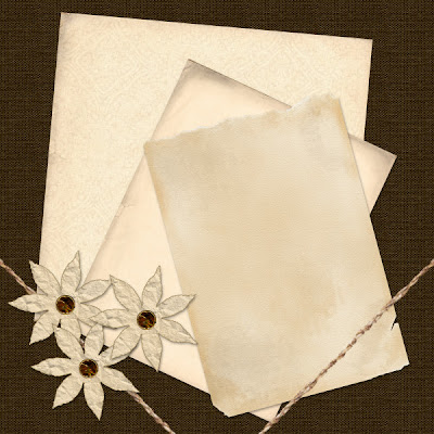
Tutorial Link
TOU from Shawna
If you do this tutorial, your end result is yours to do whatever you wish; give it away as a freebie, use it as part of a kit, or sell it for profit. A mention or a link back here would be appreciated but is not mandatory.

Tutorial Link
TOU from Shawna
If you do this tutorial, your end result is yours to do whatever you wish; give it away as a freebie, use it as part of a kit, or sell it for profit. A mention or a link back here would be appreciated but is not mandatory.
Labels:
Paper
 Artist exploration, watercolour, creativity, inspirational, digital graphics, Journal Art, Scrapbooking, design, patterns, seasonal art, fun art,
Tuesday
Sizing for Posting / Creating a Preview
Sizing for Posting / Creating a Preview
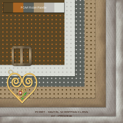
PC-ArtDSCKit1Prv.jpg - Click on image to see full size PREVIEW
weight for e-mail or web approximately 165kb
12 inch x 12 inch papers at 300 pixels per inch
Resized to
600 pixels x 600 pixels at 78 pixels per inch "smart size"
Elements resized to 17% or 20%
1 - Picture this.........
You have created a great collection of papers and elements and they are created for a 12 inch by 12 inch and 300dpi layout.
Now you want to show your kit to the world via e-mail or on the web but they are so huge!
Here is what to do.......This way you will maintain most of the detail and quality even though you are
downsizing everything.
2 - PAPERS - When you are satisfied with them - save each of them as yourpapername.jpg
I do this and then delete my paper .psp images because they are just way too big!
3 - Now you want to create a preview of your papers and you want to place all your gorgeous elements on to it as well.
4 - Open any one of your papers that are in .jpg format
Resize it from 300 dpi to 72 or 78 dpi
and change the size from 12 inches x 12 inches to 600 pixels x 600 pixels - "smart size"
5 - Now SAVE it AS yourkitnamePRV.psp
6 - Selections - select all - add a new raster layer - keep selected
7 - Open another paper and copy and paste into selection on the new layer
8 - Repeat steps 6 - 8 until you have all your papers on their own layers
9 - Selections - select none - move and rotate and position all your papers where you want them to be.
Save
10 - ADD ELEMENTS - open one of your elements
- copy and paste as a new layer onto your preview
resize only the element layer to 17% or 20%
this will show you approximately how big your element is against your 12x12 layout
11 - continue adding your elements in this way and moving them to your liking
12 - when you are happy with your preview add your name and kit name etc to the top
13 - add a new layer "select all" and crop to selection - this will get rid of all the paper edges that went out of view whilst moving them about.
14 - Merge your layers and Save your completed preview as .jpg for posting to your blog or group
Labels:
Sizing of elements
 Artist exploration, watercolour, creativity, inspirational, digital graphics, Journal Art, Scrapbooking, design, patterns, seasonal art, fun art,
Monday
Zipper
Paint Shop Pro Zipper Tutorial
by ©PCArt 26 May 2008
Using Paint Shop Pro
This is a basic tutorial guide to create a zipper in Paint Shop Pro, for your scrapping. It might be rated as an advanced tutorial because, a lot of imagination is required as I want your results to really be your own!
You will need Mura's Meister Copies. If you don't have it, do a Google search and you are sure to find it quite easily.
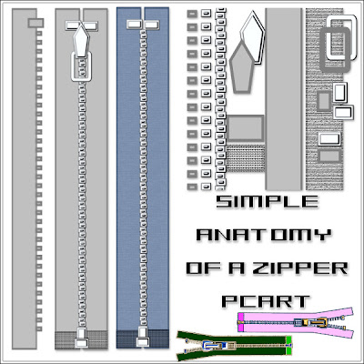
Tutorial - see the image for guidance
Open a new Image 650 pixels x 1850 pixels at 300 pixels per inch
Transparent Background.
Preset Shape Rectangle Anti-alias and Create as Vector checked
Retain style unchecked
Line style default solid Width 10
Foreground Colour #808080
Background Fill Colour #c0c0c0
1)Draw out a tall narrow rectangle and Convert to Raster layer
2)Draw Small rectangle at top of zipper and Convert to Raster layer
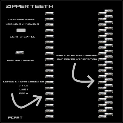
3)Draw out an even smaller rectangle for a zipper tooth - Convert to Raster layer
4)Effects Plugins Mura's Meister Copies - Reset and then change Tile Mode to V Tile
and change Number to 1 and Gap to 1 or 2 (depending on the size of the tooth)
See Zipper Teeth Image below if you want to make the teeth first and build your zip around them.
5) Use your selection tool to select and cut away extra teeth at top and bottom.
6) Apply Your Sculpture or bevel to the teeth.
7) Apply your sculpture or bevel to the small rectangle.
6) Apply your texture or colour to your long rectangle.
8) See images to place your zipper parts together.
9) Duplicate and position where necessary.
10)Use your imagination to draw the extra pieces to make your zipper details.
Once you see how easy it can be and you have got the idea of how your zipper is constructed and fits together, you can start experimenting with different shaped teeth and fabrics. Go your own way with your imagination, making your own styles and shapes and improving on details for the shaping, the teeth and zipper pull and fabric etc.,
*Idea* When you have created a set of zipper teeth that you like save as a separate image and add your fabrics to it.
Click on Image above to see a larger Preview
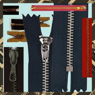
Have a look at different zippers to see how many styles there are.
by ©PCArt 26 May 2008
Using Paint Shop Pro
This is a basic tutorial guide to create a zipper in Paint Shop Pro, for your scrapping. It might be rated as an advanced tutorial because, a lot of imagination is required as I want your results to really be your own!
You will need Mura's Meister Copies. If you don't have it, do a Google search and you are sure to find it quite easily.

Tutorial - see the image for guidance
Open a new Image 650 pixels x 1850 pixels at 300 pixels per inch
Transparent Background.
Preset Shape Rectangle Anti-alias and Create as Vector checked
Retain style unchecked
Line style default solid Width 10
Foreground Colour #808080
Background Fill Colour #c0c0c0
1)Draw out a tall narrow rectangle and Convert to Raster layer
2)Draw Small rectangle at top of zipper and Convert to Raster layer
3)Draw out an even smaller rectangle for a zipper tooth - Convert to Raster layer
4)Effects Plugins Mura's Meister Copies - Reset and then change Tile Mode to V Tile
and change Number to 1 and Gap to 1 or 2 (depending on the size of the tooth)
See Zipper Teeth Image below if you want to make the teeth first and build your zip around them.
5) Use your selection tool to select and cut away extra teeth at top and bottom.
6) Apply Your Sculpture or bevel to the teeth.
7) Apply your sculpture or bevel to the small rectangle.
6) Apply your texture or colour to your long rectangle.
8) See images to place your zipper parts together.
9) Duplicate and position where necessary.
10)Use your imagination to draw the extra pieces to make your zipper details.
Once you see how easy it can be and you have got the idea of how your zipper is constructed and fits together, you can start experimenting with different shaped teeth and fabrics. Go your own way with your imagination, making your own styles and shapes and improving on details for the shaping, the teeth and zipper pull and fabric etc.,
*Idea* When you have created a set of zipper teeth that you like save as a separate image and add your fabrics to it.

Click on Image above to see a larger Preview

Have a look at different zippers to see how many styles there are.
Labels:
Zippers
 Artist exploration, watercolour, creativity, inspirational, digital graphics, Journal Art, Scrapbooking, design, patterns, seasonal art, fun art,
Tuesday
Sequins Tutorial using Paintshop Pro
Sequins by PCArt Creativity
Created with Paint Shop Pro XI

After a number of requests for a tutorial to create digital scrap sequins, I decided to try and figure out a way to make them, this is my result.
1)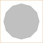
Open a 2 inch x 2 inch Transparent canvas 300 pixels per inch
Click on preset shapes and choose Dodecagon
Line solid width 2 Create as vector and Anti-alias checked
and Retain Style un-checked
On the materials palette foreground colour #808080
background fill colour #c0c0c0
Draw out your Dodecagon whilst holding down your shift key
Objects/Align/Centre in Canvas
Convert to Raster
Save as Sequin .psp image and keep open in your work space.
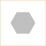
2)
Open another 2 inch x 2 inch Transparent canvas 300 pixels per inch
Go Back to Preset Shapes and with the same settings as before
and holding your shift key down draw out a Hexagon
Objects/Align/Centre in Canvas
Convert to raster
Save as Honeycomb .psp image and keep open in your work space.
3)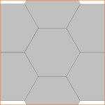
Duplicate Hexagon 6 times and move each to form a honeycomb pattern
Merge Visible
4)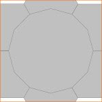
Copy Honeycomb and paste onto the Sequin (Dodecagon) image as a new Layer
Move Honeycomb Layer to bottom and keep visible
5)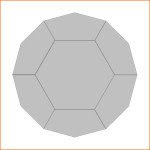
Go Back to the Dodecagon layer and click outside the shape with magic wand
expand by 1 pixel
go to down to honeycomb layer and click delete selection to get rid of the outside pieces
Move Honeycomb Layer to the top
Merge Visible
Save
6)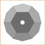
Use the Magic wand to select each area - clockwise - starting from the top one.
Top section - Adjust / Brightness and Contrast / Highlight/Midtone/Shadow / Absolute Adjustment
Shadow 0 Midtone 50 Highlight 100
Second Section change Highlight to 75
Third Section change Highlight to 55
Bottom section change Highlight to 40
Fifth Section change highlight to 50
Sixth Section change highlight to 70
Centre Change Highlight to 0
Cut a small circle out of the middle
Save
7)
Click outside your shape with your magic wand
invert and contract by 1 pixel
Keep selected
Add New layer
Layer Opacity set at BURN - fill selection with a linear gradient
Apply Noise at Gaussian Monochrome 12 if you wish
Merge visible
Re size as you wish.
SAVE as .png
Created with Paint Shop Pro XI

After a number of requests for a tutorial to create digital scrap sequins, I decided to try and figure out a way to make them, this is my result.
1)

Open a 2 inch x 2 inch Transparent canvas 300 pixels per inch
Click on preset shapes and choose Dodecagon
Line solid width 2 Create as vector and Anti-alias checked
and Retain Style un-checked
On the materials palette foreground colour #808080
background fill colour #c0c0c0
Draw out your Dodecagon whilst holding down your shift key
Objects/Align/Centre in Canvas
Convert to Raster
Save as Sequin .psp image and keep open in your work space.
2)

Open another 2 inch x 2 inch Transparent canvas 300 pixels per inch
Go Back to Preset Shapes and with the same settings as before
and holding your shift key down draw out a Hexagon
Objects/Align/Centre in Canvas
Convert to raster
Save as Honeycomb .psp image and keep open in your work space.
3)

Duplicate Hexagon 6 times and move each to form a honeycomb pattern
Merge Visible
4)

Copy Honeycomb and paste onto the Sequin (Dodecagon) image as a new Layer
Move Honeycomb Layer to bottom and keep visible
5)

Go Back to the Dodecagon layer and click outside the shape with magic wand
expand by 1 pixel
go to down to honeycomb layer and click delete selection to get rid of the outside pieces
Move Honeycomb Layer to the top
Merge Visible
Save
6)

Use the Magic wand to select each area - clockwise - starting from the top one.
Top section - Adjust / Brightness and Contrast / Highlight/Midtone/Shadow / Absolute Adjustment
Shadow 0 Midtone 50 Highlight 100
Second Section change Highlight to 75
Third Section change Highlight to 55
Bottom section change Highlight to 40
Fifth Section change highlight to 50
Sixth Section change highlight to 70
Centre Change Highlight to 0
Cut a small circle out of the middle
Save
7)

Click outside your shape with your magic wand
invert and contract by 1 pixel
Keep selected
Add New layer
Layer Opacity set at BURN - fill selection with a linear gradient
Apply Noise at Gaussian Monochrome 12 if you wish
Merge visible
Re size as you wish.
SAVE as .png
Labels:
Digital Art,
Paintshop Pro,
Scrapbook Elements,
Scrapbooking,
Sequins,
Tutorial
 Artist exploration, watercolour, creativity, inspirational, digital graphics, Journal Art, Scrapbooking, design, patterns, seasonal art, fun art,
Wednesday
Quick 'n Easy Buckles Tutorial
Quick 'n Easy Buckles
by PCArt
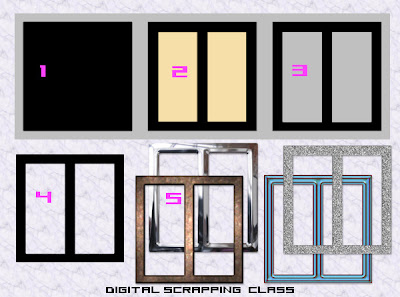
I know I had some problems making the buckle and I also know I'm not the only one who had difficulty following the tutorial we have. So here is my quick 'n easy solution!
(My buckle was drawn out on a 300 x 300 pixel canvas at 300 pixels per inch.)
Fill your canvas with a light grey.
1) Using your square preset shape - vector and antialias checked - background fill colour black - draw out a square for your buckle as large as you want it to be. Object / align / centre in canvas. Convert to raster.
2) On a new layer using your rectangle preset shape - vector and antialias checked - background fill any other colour - draw out a rectangle where you want the left hand opening of the buckle to be. Position it exactly as you want it to be. Duplicate this layer and go to image mirror. Close your bottom layers. Keep only the twin rectangles visible. Merge visible.
3) View all layers again. On the twin rectangle layer - selections / select all / selections / float / selections defloat. Selections / Modify expand x 1 pixel - go to your black layer and press delete. Selections None.
Go back to your twin rectangle layer and delete it. Go to your grey layer and delete it.
4) You now have a Template for your buckles. SAVE AS BUCKLE TEMPLATE.psp image
5) Use your template "selected and expanded x 1 pixel / antialias checked "
- then on a new layer - fill with colours, patterns, apply bevels, sculptures, etc.
Cut your finished buckles and paste each as a new image and Save As .png
by PCArt

I know I had some problems making the buckle and I also know I'm not the only one who had difficulty following the tutorial we have. So here is my quick 'n easy solution!
(My buckle was drawn out on a 300 x 300 pixel canvas at 300 pixels per inch.)
Fill your canvas with a light grey.
1) Using your square preset shape - vector and antialias checked - background fill colour black - draw out a square for your buckle as large as you want it to be. Object / align / centre in canvas. Convert to raster.
2) On a new layer using your rectangle preset shape - vector and antialias checked - background fill any other colour - draw out a rectangle where you want the left hand opening of the buckle to be. Position it exactly as you want it to be. Duplicate this layer and go to image mirror. Close your bottom layers. Keep only the twin rectangles visible. Merge visible.
3) View all layers again. On the twin rectangle layer - selections / select all / selections / float / selections defloat. Selections / Modify expand x 1 pixel - go to your black layer and press delete. Selections None.
Go back to your twin rectangle layer and delete it. Go to your grey layer and delete it.
4) You now have a Template for your buckles. SAVE AS BUCKLE TEMPLATE.psp image
5) Use your template "selected and expanded x 1 pixel / antialias checked "
- then on a new layer - fill with colours, patterns, apply bevels, sculptures, etc.
Cut your finished buckles and paste each as a new image and Save As .png
Labels:
Buckles
 Artist exploration, watercolour, creativity, inspirational, digital graphics, Journal Art, Scrapbooking, design, patterns, seasonal art, fun art,
Thread your Buckle Tutorial
Thread your Buckle
Quick Tutorial from PCArt
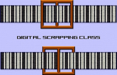
Place a ribbon on your canvas
place the buckle on top of the ribbon on a new layer where you want it to be
duplicate the buckle layer and move the duplicate layer to the bottom
go back to the buckle on the top layer
selections / select all / selections float / selections defloat
stay on top layer and keep selected
use the eraser to erase the buckle bar in the middle so that the ribbon underneath shows through.
OR erase the outer bars instead so that the ribbon threads through the opposite way.
Quick Tutorial from PCArt

Place a ribbon on your canvas
place the buckle on top of the ribbon on a new layer where you want it to be
duplicate the buckle layer and move the duplicate layer to the bottom
go back to the buckle on the top layer
selections / select all / selections float / selections defloat
stay on top layer and keep selected
use the eraser to erase the buckle bar in the middle so that the ribbon underneath shows through.
OR erase the outer bars instead so that the ribbon threads through the opposite way.
Labels:
Buckles
 Artist exploration, watercolour, creativity, inspirational, digital graphics, Journal Art, Scrapbooking, design, patterns, seasonal art, fun art,
Subscribe to:
Posts (Atom)
