Sunday

Faux Felt Shapes


Tutorial - ELEMENT: Faux felt shapes - (By Tracey Renemo 2006) -

*2017 - The link to the tutorial is no longer available - please see my notes below.


Note from Pat

Here are my step by step instructions - all credit goes to Tracey Renemo for originally writing the faux felt tutorial.

1) Open the felt-like pattern in your work space and minimize it.

2) Open a new canvas 6 inches by 6 inches at 300 pixels per inch transparent
3) Go to your materials palette background and select your felt-like pattern there, Scale 100 Angle 0
4) Go to your materials palette foreground and choose your colour
5) Flood fill your canvas with your colour
6) Add a new Raster Layer, swap your materials to your felt-like material and flood fill
7) Your Material layer should be the one on top and colour on the layer underneath
8) Change the Opacity on the material layer to Luminance
9) If you don't like the colour go back to your bottom layer and change it
10) When you are happy with your colour Merge Visible layers.
11) Add a new Raster Layer
12) Choose the shape you want to use and draw it on the new layer - if it is a vector convert to raster

*Before converting to a raster layer you could add stitching around the edge using your vector tube script and stitches tubes

13) When your shape is converted to Raster -
Click on the magic wand - change the Feather setting to about 5
14) Click on the outside of your shape then go to your bottom layer and delete the selection
15) Close the top layer with the drawn shape and see your felt shape
16) Use the undo button whenever you want to and repeat steps until you are satisfied.
17) Happy with your result? Delete the layers you don't need and then save your new felt shape
18) Selections / Select All / Selections / Float / Selections / Defloat
19) Image / Crop to Selection
20) Save as .png

If you have any problems with this tutorial please contact me and I will do my best to assist you.


Saturday

Paper Piecing


Simply draw out different colour preset shapes and rotate them to suit what you want, add textures, slight bevels and shadows - do your own thing!


Wednesday

First Layout

First Layout


Note from Pat

First decide which image or photo you want to use in your layout.
Then you can use it as a guide as to the colours and journaling that you want to put into your layout.

Make your layout similar to mine above if you wish.

You could use your own - Glitter Elements from Lesson 36 - Charms from Lesson 4 - and any Ribbons or Papers or other Elements that you have already made yourself!

I am using my poem "A Mother's Love" for the journaling and an image of my Grandmother.
Resized Preview is 600 x 600 pixels at 78 pixels per inch smart size


Text on a path

Text on a Path

https://scrapbookcampus.com/2016/07/text-on-path-in-paintshop-pro/


Tutorial Note from Pat
If your text is not moving along your line enough, add spacing at the beginning to push it along the curve.


Tuesday

Metal Charm Elements

Metal Charm Elements

Creating a Metal Charm (by Bruticia) * 2017 - tutorial link no longer available - see my notes below.


Notes from Pat

Try different shapes, and sizes - also test different line widths from 5 to 10, try adding gems or other decoration.

Save the finished charms in .png format like the heart above. Eventually try different sculptures and metal or other effects.

......Go to Effects~Texture Effects~Sculpture
Presets~Gold and click ok......
This is the plain gold that should be available and should be visible in your Sculpture pattern window.

If you do not have it then save this Gold.bmp to your Paint Shop Pro pattern folder.

When you click on Presets - and your Sculpture options box pops up
click on the bent back arrow to restore to default
then click on the menu arrow there and scroll down to find Gold and accept the settings. OK

The Gold default settings should be
Size 100 Smoothness 10 Depth 3 Ambience 0 Shininess 46
Angle 315 Intensity 30 Elevation 56 Colour White

When creating your charm for some shapes you might want to make your line width thinner or thicker - it also depends on how large your charm is.

Also where the dark colour is - the sculpture goes inward and where the light colour is the sculpture comes outward.


The thing with scrapping is you can make the same or similar things over and over again for use in different layouts and themes - so let your imaginations run wild.

Find New Shapes at Scrap Stuff With PSP while they are still available!

Monday

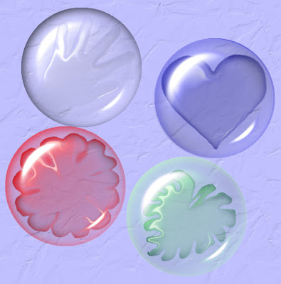
Glass stones

Glass Stones

Tutorial - Glass Stones (originally by Lori J. Davis) - As with many tutorials that have been on line for many years, the links become unavailable! * Read notes below and you should be able to achieve a result.


Here I played with shapes and the warp tool and different colours to create the shapes underneath my stones.

Tutorial Note

Open new canvas 400 pixels x 400 pixels
Click on Effects / Artistic effects / Balls and Bubbles
Click on last used and select ljd_GlassStone preset,
Lower the zoom to about 22 so you can see the whole bubble
then you will see will see a little deformation bounding block
push the corners inwards to lower the size of your bubble slightly.

Extra Note for those who cannot use or do not have the ljd_GlassStone preset
here are the Manual Settings in Artistic Effects / Balls and Bubbles

Shape - single ball or bubble
Surface - colour #ffffff Opacity 15 Shininess 50 Gloss 80
Maps - none
Illumination - Maximum 15 minimum 0 Lights 1 colour #ffffff highlight size 28
Save as GlassStone preset

Follow tutorial and then these are her shadow settings

Shadow Horizontal and Vertical 6
Opacity 70 Blur 37 Colour #000000
Save as GlassStone shadow

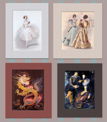
Choosing the Right Mat Colour

Choosing the Right Mat Colour


Using any image of your choice - use your colour picker to choose a complimentary or contrasting colour that suits your image to make your frames and mats.

I chose to images from Public Domain

Note from Pat

Add a texture and slight inner bevel and drop shadow.
You could save your mat frame separately as a .psp image or .png image for future use.

My results for posting - merged all layers and resized to 78 pixels per inch and 600 pixels on the largest side, smart size. Saved AS mymatname.jpg

After doing this exercise, you might also want to go to "2 create your own colour palettes" and make your image mats or frames, by choosing from the palette colours.


Sunday

Colour Palette and Theme

Colour Palette and Theme

Create your Colour Palette/Choose Your Theme

Tutorial Notes by pat/PCArt
Before you can create your "kit" you need to have a few ideas to plan what you want to accomplish.

We need to Think about these things when creating our kit.

What do you want to make - Are you making a whole kit, a quick page, or a Greeting Card. Is it a series of papers and elements, ribbons, tags, brads and all?
Keep a little note book nearby. Perhaps you could make quick mini sketches of your ideas on a piece of paper, this will help you to create your layout ideas. Write down any ideas you have to help you construct your kit. Write down anything you don't want to forget.
Image/Photo - decide which image/s or photo/s to concentrate on.
Colour/Palette - Then you need to choose your colours. This is where you decide what colours your frames, papers, ribbons and so on are going to be. Use this as a quick reference while creating your kit.
Occasion/Reason - Birthday, Love, Wedding, Season, Holiday, Children, Someone special, Pet?
This will help you decide what kind of elements or patterns you want to use.
What is it going to be used for? Is it for own personal use, is it for Printing, or for Giving away as a Freebie, or for the web, do you want to sell it on your Blog?
If it is for Printing or giving away as a Freebie or Selling on your Blog - you need to think about size!

Read this Article Print Design vs. Web Design
so that you can understand more about where we are going. It is very important to make sure that your sizing is appropriate for the use. Remember you can size down fairly easily but sizing up really is not an option.

Creating graphics for the web or your e-mails does not use a lot of memory, but creating "professionally" at the size and dpi or ppi required for quality printing does!
Unless you have an mega powerful computer, you need to be prepared to work a little slower as large images take time and patience.

When giving away or sharing
1) Always state on your work what it is to be used for and in what format it is saved.
For example "Papers are for 12" x 12" layouts and created in 300dpi .jpg format"
This tells your guest/customer exactly what they are getting.
It could be that "Images are created for use on the web or in e-mails and are 72dpi .jpg format"
or "Elements are created for printing on 12" x 12" layouts and are 300dpi in .png format"
2) Always state your Terms of Use!

TUTORIAL Create your Colour Palette
(by PCArt)
Open the image you want to use for your colours - duplicate it - close the original.
Go to Image / Decreased Colour Depth / 16 Colours
Settings Palette - optimised median cut and Reduction - Nearest Colour / OK
Now look at your colour palette in Paint Shop Pro - it shows you only 16 colours.
Open a new image 300 pixels x 50 pixels
paintbrush click on presets and click on the little bent arrow to get to your brush default setting then change your settings to Square - Size 50 - and Hardness,Density,Opacity all at 100
Use your dropper tool to choose your colours from your 16 colour palette in Paint Shop Pro.
Paint your palette choosing the 6 colours you want to use.

You need to click back and forth from your decreased colour image to pick your colours from the palette in Paint Shop Pro and then go back to your new image to paint the squares.
Add a thin border if you wish and name your palette.
Save as .jpg

Here is my result
I used the 6 middle colours on the left side of my 16 colour palette


Here is a blank palette for you


Just open it in your workspace copy it and close the original

Now as you choose your colours you can flood them into your blocks.
Save your colour palettes as .jpg images and save them in your work in progress (kit) folder or class folder - you can then open your palette up in your psp work space and use it to refer back to while you are working on creating your kit.
I hope this is helpful to you

Now there are many ways to do something if you know how and following my post today I have had a few interesting alternatives to test.

Thankyou Patrick for sharing this interesting link http://whatsitscolor.com/- this was way too much fun!
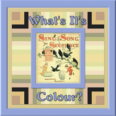

I never imagined that one of my favourite shades of blue
was the complimentary colour to this little image that I have been testing
with all the colour palette tricks today!

This is really a fun way to quickly sort colours for a kit!
Complimentary Dominant average colour on frame #92a2d7
Dominant average colour this page background #d8c892
Top 10 of 94 unique colours in the little image are in the patterned background.

Another way to create your colour palette using Toadies - Thank you TM
Here I used the image again from above.
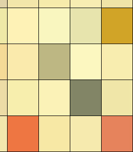

Made a copy and closed the original
Effects/ Plugins / Toadies / Plain Mosaic 2 / Cell Width and Height both to 61 / Alpha Threshold 0 /Edge/Hard/Soft/Off 0
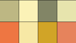
I hand picked the colours I fancied with the magic wand,
and copied and pasted them onto my palette.



Friday

Ribbons and Bows

Ribbons and Bows


Try Shawna's Suede Ribbon too

Now you have had fun making ribbons flat and curled - how about trying your hand at making bows?
Look at bows see how they are constructed then make a copy of your ribbon and cut and paste your pieces into position.

Use the warp tool and or warp brush to bend and push the ribbons into shape
Use your curls for the ribbons hanging down.

Remember to practice and experiment cut them, paste them, twist them, warp them, and colourize them!!


Use the warp tool to bend the ribbons hanging down. Remember practice makes for improvement.

Thursday

DLL files needed

DLL Files Needed

Sometimes we add plugins or filters to our graphics program and they just don't seem to be there.

There are 5 different DLL files needed to run most filter/plugins/add ons with your Paintshop Pro graphics program that are NOT always installed or are not located in the proper folder for your operating system.

I am uploading them to our files section so you can get the ones you do not have.
I have scanned them with AVG and they are clean but always scan things yourself for peace of mind!

MSVCRT10.DLL
msvcrt20.dll
Msvcrt40.dll
msvcrt.dll
plugin.dll

If after installing a plugin/filter AND once you have restarted your graphics program you get a message saying your program is unable to load it, place the above listed DLL's from the zip file as follows:

Windows98: All DLL's go in C:\Windows\System

WindowsME: Plugin.dll goes in your C:\Windows folder AND into your graphics program plugins folder. Msvcrt10.dll goes in your C:\Windows\System folder.

Windows2000: All DLL's go in C:\WINNT\System32

WindowsXP: All DLL's go in C:\Windows\System32

Vista - All DLL's go in C:\Windows\System32

They apparently cannot do any damage - if you put them in the wrong place they will not work.
If they are in the right place they work immediately.

Wednesday

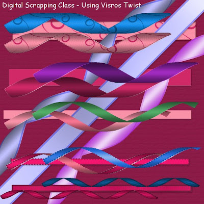
Curled Ribbons with Visros (if you have it)

Curled Ribbons with Visros

based on settings by Laura White  Tutorial link no longer available. See notes below and have fun experimenting!


Open a new image 600 x 600 pixels at 300 pixels per inch.
Draw out a rectangle using preset shapes
Convert to raster layer
Fill with pattern or colour of choice
Keep selected
Apply chosen texture

Go to your plug-in menu, choose Visros, then Twist.
Use the settings below.

Position - Top left
Selection - Input
Parameters
direction - 30
location - 100
radius - 30
Page properties
Keep going back to Page Properties
and go to each of the property options and choose

Fore Page - image (the rectangle you drew) - opaque
Back Page - solid custom color - opaque -
(on the patterned ribbon I used - image - master image - opaque)
(on the plain ribbon I used - solid - customer colour and chose a darker shade)
(on the pale pink ribbon I used - solid - front colour - opaque)

Ground Page - solid - transparent - make sure the slider is fully to transparent
Unselected page - solid - transparent

As always, Experiment,
Try changing the direction / location / radius / settings
and using Adjust / Hue and Saturation / Hue/Saturation/Lightness - try colourizing your finished ribbons

Maybe try adding Greg's Pool Shadow to your straight ribbons - use intensity at about 52


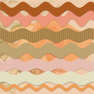
Rick Rack or Ric Rac

Rick Rack

Tutorial - Rick Rack from (Pracken's Paint Scrapbook Series)

I absolutely love the variety of tutorials and skill from this talented lady!


Creating Rick Rack or Ric Rac (I wonder what the correct spelling is here?) was easier than I thought it would be so I enjoyed this valuable lesson.


Tutorial Note from Pat

Click image for larger preview.
I drew mine on 17 inch x 1 inch canvas at 300 pixels per inch with a line width of 150 (to be able to use it corner to corner if need be on a 12 inch page)
I used a pale blue gradient to draw the line - Angle 0 / Style Linear / Repeats 7
At this size I made my Effects / Distortion / Wave settings
Horizontal - Amplitude 0 Wave Length 1
Vertical - Amplitude 6 Wave Length 3
SAVE AS .png

Experiment

Copy your rick rack and paste as a new layer
Try adjusting colours, using
Adjust / Hue and Saturation / Hue/Saturation/Lightness
Experiment with textures and other material fills, blinds effects etc.,

Tuesday

Size Guide

Element and Paper Sizes

Digital Scrapping Size Guide for Elements and Papers
by PCArt


This is a quick visual size guide for Digital Scrapping, these are basically the sizes I work with and I hope these guides will be helpful to you.


Note:- Images have been re sized for Preview from 12 inch x 12 inch 300 pixels per inch to 78 pixels per inch and 600 pixels x 600 pixels / Smart Size / All Layers.

Converting Scraps Printing sizes
to TAG for web sizes

(by PCArt)

A question comes up quite often when creating Scraps for printing - about them being so big, and how people who do NOT want to print but only want to create for making TAGS for the web and for e-mail, don't know how to adjust thier sizes.

When you look at tags sometimes large elements like paper clips and buttons are used "almost as big".

It really is a question of personal taste.

Can you believe converting your size while creating from a tutorial is this easy?
Simply follow the Scrapping tutorial with the dimensions given, But change from 300 pixels per inch to 72 pixels per inch :)


Please note that creating on a smaller image also means down sizing the textures etc., given in the tutorials, so you will need to experiment with effects and filters to suit yourself.

Also a 12 inch x 12 inch paper will still be too big for a tag even at 72 pixels per inch so if you plan on creating a "paper" for your tags make it about 600 x 600 pixels at 72 pixels per inch.

EXAMPLES
POST CARD Print Size 6 inches x 4 inches at 300 pixels per inch as per Scrapping Tutorial/size guide.
*Converted to TAG size - same dimensions 6 inches x 4 inches at 72 pixels per inch
Postage Stamp for print size 1 inch x 1,5 inches 300 pixels per inch as per Scrapping Tutorial/size guide.
*Converted to TAG size - same dimensions 1 inch x 1,5 inches at 72 pixels per inch

Monday

Make Stickers

Making Stickers

Make sticker like images by using preset shapes and then adding a white flat edge to your images.

Use the magic wand to select areas of the image and while selected, apply a soft bevel to those areas to make them appear raised or cushioned above the white edges.


Try applying a texture to your areas of colour and a soft bevel too.

Make your own Brads

Make Your Own Brads

Using the skills you have already acquired, open a new image and then using shapes - circle, select and while selected fill with patterns and use image effects kaleidoscope to create amazing patterns. Apply a slight bevel to the edge and there you have a lovely brad!  Save as a .png image to place on your scrapping pages.


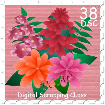
Postage Stamp


Tutorial - Creating a Postage Stamp  * 2017 tutorial link is no longer available - see notes below.
(By Zee Helmick)


Click on Image to see Preview shown at 600 pixels x 600 pixels at 78 pixels per inch

Tutorial Note from Pat

I worked on a 3 inch x 3 inch canvas at 300 pixels per inch
Flood fill with a colour to work over.
Add new Raster Layer / Selections select all contract x 41 flood with white
To cut the edges
View / Grids to see them / View / Change grids to 45 vertical and 45 horizontal
Eraser - Size 45 / erase dot on every other grid crossing around the white edge
Text - I used Comic Sans MS - sized at 30 points, 15 points and 12 points
Decorate with image of your choice.
I applied an Inner bevel to my stamp and a drop shadow, and saved as .png


Saturday

Patchwork Flower Layout

Tutorial - Patchwork Flower Layout - * 2017 link no longer available
(by Zee Helmick)

Sorry the link is not available but use the image below as inspiration to create a similar layout.
Please share your results in our Facebook group -  Art & Digital Art Friends and use this patchwork flower template if you wish.


Ballet Image from Public Domain


Friday

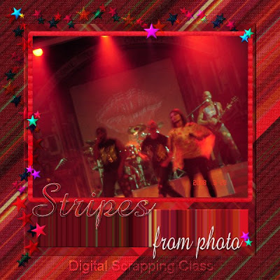
Stripes from a Photo

Tutorial - Stripes from Photo no longer available (by Lori J Davis)

Here is another tutorial using Photoshop - but it will work in Paintshop Pro with a few little tweeks.

This tutorial can be used to create stripes for a paper or to create a different colour pallete if you are having difficulty choosing colours to work with for a certain image.

It can be used as a pattern fill - Experimenting with your program and colours, effects and settings is the key to creating something you did not at first expect.

A lot of my things are made "by accident" simply because of experimenting.

Just one thing - if you get something you really like - save it! (or write it down in a note book so you can remember how you did it, or so that you can tell us how you did it!)


Thursday

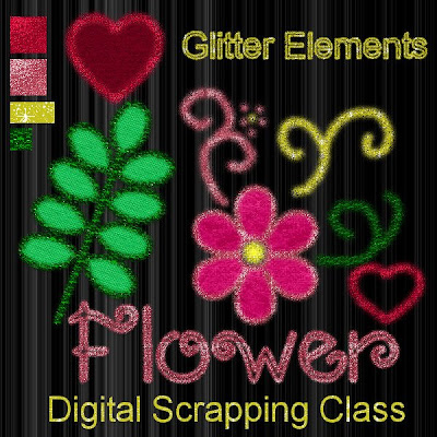
Glitter Elements

Tutorial - Creating Glitter Elements - 2017 the link no longer works - see notes below.
(by Tracey Renemo)

Thanks to the wonderfully talented and generous teachers who share their talent and tutorials, I am continually learning!

Right click on this image and open in a new window to see a larger preview of the glitter.

The link given in tutorial for glitter does not work - use any glitter you have or use the ones I have here


you can also re-colour them and save them as a new colour .jpg

Things to do to set up for your Glitter Elements, you need the vector paint script.
it is not as complicated as you may first think it is! 
Unzip your Paint script and place it in your Scripts Restricted Folder.

Briefly it is this easy to do.
1 - Download Script - unzip and place your script in the correct folder.
2 - Find a glitter to use and open in your work space to view in your materials patterns palette.
3 - Open new canvas
4 - Set up your paint brush settings as set out below (save as your own preset)
5 - Choose your preset shape, or lettering, and place on your canvas. (as Vector)
6 - Run your script - File/Script/Run and choose Vector Paint Script and see what happens
7 - Keep on experimenting! Adjust your brush size and try again.

I have icluded the Glitters that I used.
You could also just paint your glitter on like doodles by hand with your paint brush.

Read through the tutorial carefully - then read my notes.

(I do not have the coloured noise brush)
Click on your Paint Brush and set to default
(click brush presets and click on bent back arrow to get to default)
Paint Brush Settings.
Round - size 17 - hardness 4 - step 35 -density 70
thickness 100 - rotation 0 - opacity 100 - blend mode normal
continuous unchecked - wet look paint unchecked.
Click View/Palettes/Brush Variance
all settings on 0 except Fade 100 - position jitter 5 - impressions per step 1
Open your choice of glitter pattern in your Paint Shop Pro work space.
Any open image in your workspace can be viewed in your Materials/patterns palette.
Save Brush Preset. Click on Brush Preset and then on the save disk image give your preset a name.

As you can see on my preview some glitter is smaller, just go to brush - change your size and then go back to run your script - use the undo button if you need to.
The script can only be run on the vector layer while it is a vector.
I use Paint Shop Pro XI - I can type text and then under the objects button - convert to path - I can then run the script on lettering too. However, if you are unable to do this you can select your text and float/defloat expand selection and paint your glitter by hand into your selection.

Email me for help if needed. See side bar.


Wednesday

Beads on a Wire & Wire Words

Tutorial - Beads on a Wire (by Tracey Renemo) * 2017 tutorial no longer available, see notes below.


Tutorial Note from Pat

Here I drew a curved vector line across my page and used a script to place the beads, then placed smaller beads by hand in between the larger ones. I then texturized and sculptured the line to make it like a string or cord.

Don't be afraid to experiment with sculptures, bevels, textures and colourization, you will be surprised what you can come up with!

Try using preset shapes or vector shapes and use your vector/tube paint script to place your beads, or place them by hand individually, on wire words for example.

Wire Words Tutorial

See 16 Beads for a tutorial on making your own beads


Thanks to the wonderfully talented and generous tutorial writers who share their talent, I am continually learning!

Tuesday

Photo Prong


Look at these prongs - can you see the simple shapes? Ovals and circles. This is where you begin creating your prongs with shapes.


Tutorial Notes from pat/PCArt

Save your first prong as a flat grey template with your brad still on a separate layer.


Copy and use your template to make many different brads.
When you are finished and your layers are merged,
go to Selections / Select all / Float / Defloat and crop to selection.
Save as .png

Try Different bevels, Textures, Sculptures, Pattern Fills,
The possibilities are endless!


This was a 12 inch x 12 inch page and the finished prongs were pasted onto it.

When viewing the page in Paint Shop Pro at 100% the Prongs are as big as you see the loose ones in this post, but on the page when viewed in Paint Shop Pro at between 17%and 20% which is about how big it would be when printing it out, they appear proportionately on the page as you see them above in this preview.

Perhaps this helps to explain why we create our elements "so big" :)

Chalked Edge Effect

Tutorial - Chalked Edge Effect
(By PCArt)


Using Paint Shop Pro - Open new canvas 600 x 600 pixels 300 pixels per inch
Fill with your colour choice

duplicate layer

On copy layer
Go to freehand selection tool - draw a narrow random selection quite close to the edge
all the way around your canvas to select the edge to be chalked.
(You could also Select modify and contract however much you want to)
Delete inner selection. (leaving edge on canvas) Select None.
Effects / Art Media Effects / Coloured Chalk - detail 20 - Opacity 20
Adjust Blur Gaussian Blur 13
Adjust add / remove noise - add noise - uniform - monochrome - 17%
On Chalk Layer Adjust /Sharpen and change layer property to Lighten.

(Optional - Apply texture to both layers)
I used Texture Canvas Coarse, size 150 depth 1 (smoothness, ambience, shininess 0)
Angle 315, Intensity 50, Elevation 30.

Merge Visible Layers and Save

Try this technique with other shapes.


Stamped Text


Note from Pat

Using Paint Shop Pro - on a 600 x 600 pixel canvas - played with the words, cutting and pasting them where I wanted them to be.

Heart was done with preset shape and stitches done with a script and then the stitches colour was adjusted using -Adjust / Hue and Saturation / Hue /Saturation/Lightness - I experimented with the settings until I got the colour I wanted.

The white lettering layer was lowered in opacity and nothing else was done to it.

I used Filters Unlimited for the background texture and a Rose preset shape, coloured, texturized, and lowered in opacity.

Adler Font