Wednesday

Thread your Buckle Tutorial

Thread your Buckle
Quick Tutorial from PCArt


Place a ribbon on your canvas
place the buckle on top of the ribbon on a new layer where you want it to be
duplicate the buckle layer and move the duplicate layer to the bottom
go back to the buckle on the top layer
selections / select all / selections float / selections defloat
stay on top layer and keep selected
use the eraser to erase the buckle bar in the middle so that the ribbon underneath shows through.

OR erase the outer bars instead so that the ribbon threads through the opposite way.

Monday

Doodles

DOODLES

Get your pen and paper out and start doodling!

Tutorial Note

**If you are drawing your doodles by mouse on your canvas in Paint Shop Pro...You will find that if you adjust your tracking to a higher number, your doodle lines will be smoother. Do a test and see with tracking at 1, you get jagged edges, then change the tracking to around 50 - 100 and the edges become smoother.


**Doodles above drawn on White paper with a black Paper Mate Fineline pen.
I browsed though some fairy images I have on my PC to get a few ideas for the doodles. An artist I once knew always said that we do need reference material!


I made this lot playing with lines and vectors and preset shapes and used the wave setting and also played with layer opacity .....and the vine is supposed to look like lizards :) I remember seeing an armband tattoo on a friend, designed by her husband a few years ago, so I kind of played with that from memory.


Sunday

Eraser Brush Paper

Eraser Brush Paper
by PCArt

The eraser can be a useful tool when creating papers - decorate the top layer using various brush patterns along with the eraser instead of the paint brush to pull the bottom colour through in places.


Open a new Canvas (12 inch x 12 inch at 300 pixels per inch)
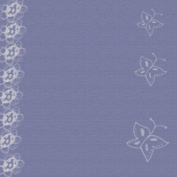
Fill your canvas with a colour or a pattern.
*I filled the bottom layer with a pattern fill "Cracked paint"
Add a New Layer and fill with another colour or pattern.
*I filled mine with colour #989dc4
Click on your eraser tool and then choose a brush pattern.
Then on the top layer
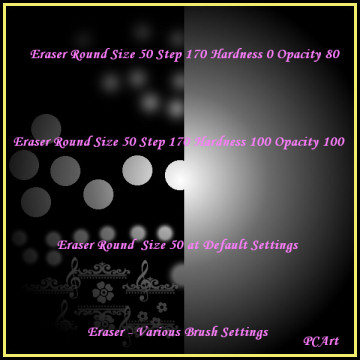
Use the eraser at various settings, changing the size, step, density and opacity to see how your eraser works.
Then change your top layer opacity options to dodge, or burn or difference, or luminance etc.
and notice the various results! You will be pleasantly surprised by the different effects you can create.,
*Mine is on Multiply.
Apply additional Texture if you wish or even more layers and repeat what you have done.
* My texture is Effects / Texture Effects / Textures set to Default - then Texture - Grain Long - size 270 and depth 3
- then merge the layers and save as yourpapername .jpg
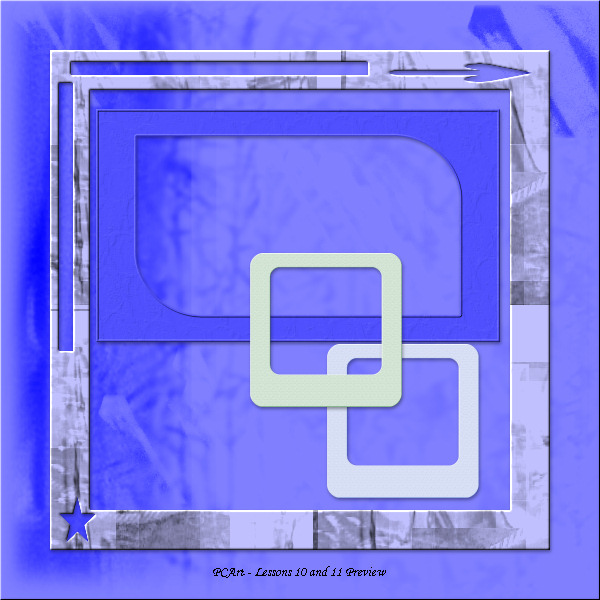
Preview resized to , 78 pixels per inch at 600 pixels by 600 pixels smart size.

When creating Grunge effect on Papers or items - the trick is to play with multiple layers set at different layer properties such as overlay, burn, dodge etc., and also the opacity of those layers - and distressing your layers even more by using your eraser brush.


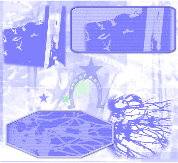
I made the brushes from photographs I took of seagulls flying past my window, and from a bunch of lilies and twigs at Christmas time,the others were from preset shape star just brushed on in different colours and at different sizes, and a stamp from a horseshoe I tubed previously. I made the background from pieces of photos from some bits of some of my other odd photos all pieced together and overlaid and layer properties blend modes and opacity played with.

Faux Felt Shapes


Tutorial - ELEMENT: Faux felt shapes - (By Tracey Renemo 2006) -

*2017 - The link to the tutorial is no longer available - please see my notes below.


Note from Pat

Here are my step by step instructions - all credit goes to Tracey Renemo for originally writing the faux felt tutorial.

1) Open the felt-like pattern in your work space and minimize it.

2) Open a new canvas 6 inches by 6 inches at 300 pixels per inch transparent
3) Go to your materials palette background and select your felt-like pattern there, Scale 100 Angle 0
4) Go to your materials palette foreground and choose your colour
5) Flood fill your canvas with your colour
6) Add a new Raster Layer, swap your materials to your felt-like material and flood fill
7) Your Material layer should be the one on top and colour on the layer underneath
8) Change the Opacity on the material layer to Luminance
9) If you don't like the colour go back to your bottom layer and change it
10) When you are happy with your colour Merge Visible layers.
11) Add a new Raster Layer
12) Choose the shape you want to use and draw it on the new layer - if it is a vector convert to raster

*Before converting to a raster layer you could add stitching around the edge using your vector tube script and stitches tubes

13) When your shape is converted to Raster -
Click on the magic wand - change the Feather setting to about 5
14) Click on the outside of your shape then go to your bottom layer and delete the selection
15) Close the top layer with the drawn shape and see your felt shape
16) Use the undo button whenever you want to and repeat steps until you are satisfied.
17) Happy with your result? Delete the layers you don't need and then save your new felt shape
18) Selections / Select All / Selections / Float / Selections / Defloat
19) Image / Crop to Selection
20) Save as .png

If you have any problems with this tutorial please contact me and I will do my best to assist you.


Saturday

Paper Piecing


Simply draw out different colour preset shapes and rotate them to suit what you want, add textures, slight bevels and shadows - do your own thing!


Wednesday

First Layout

First Layout


Note from Pat

First decide which image or photo you want to use in your layout.
Then you can use it as a guide as to the colours and journaling that you want to put into your layout.

Make your layout similar to mine above if you wish.

You could use your own - Glitter Elements from Lesson 36 - Charms from Lesson 4 - and any Ribbons or Papers or other Elements that you have already made yourself!

I am using my poem "A Mother's Love" for the journaling and an image of my Grandmother.
Resized Preview is 600 x 600 pixels at 78 pixels per inch smart size


Text on a path

Text on a Path

https://scrapbookcampus.com/2016/07/text-on-path-in-paintshop-pro/


Tutorial Note from Pat
If your text is not moving along your line enough, add spacing at the beginning to push it along the curve.


Tuesday

Metal Charm Elements

Metal Charm Elements

Creating a Metal Charm (by Bruticia) * 2017 - tutorial link no longer available - see my notes below.


Notes from Pat

Try different shapes, and sizes - also test different line widths from 5 to 10, try adding gems or other decoration.

Save the finished charms in .png format like the heart above. Eventually try different sculptures and metal or other effects.

......Go to Effects~Texture Effects~Sculpture
Presets~Gold and click ok......
This is the plain gold that should be available and should be visible in your Sculpture pattern window.

If you do not have it then save this Gold.bmp to your Paint Shop Pro pattern folder.

When you click on Presets - and your Sculpture options box pops up
click on the bent back arrow to restore to default
then click on the menu arrow there and scroll down to find Gold and accept the settings. OK

The Gold default settings should be
Size 100 Smoothness 10 Depth 3 Ambience 0 Shininess 46
Angle 315 Intensity 30 Elevation 56 Colour White

When creating your charm for some shapes you might want to make your line width thinner or thicker - it also depends on how large your charm is.

Also where the dark colour is - the sculpture goes inward and where the light colour is the sculpture comes outward.


The thing with scrapping is you can make the same or similar things over and over again for use in different layouts and themes - so let your imaginations run wild.

Find New Shapes at Scrap Stuff With PSP while they are still available!

Monday

Glass stones

Glass Stones

Tutorial - Glass Stones (originally by Lori J. Davis) - As with many tutorials that have been on line for many years, the links become unavailable! * Read notes below and you should be able to achieve a result.


Here I played with shapes and the warp tool and different colours to create the shapes underneath my stones.

Tutorial Note

Open new canvas 400 pixels x 400 pixels
Click on Effects / Artistic effects / Balls and Bubbles
Click on last used and select ljd_GlassStone preset,
Lower the zoom to about 22 so you can see the whole bubble
then you will see will see a little deformation bounding block
push the corners inwards to lower the size of your bubble slightly.

Extra Note for those who cannot use or do not have the ljd_GlassStone preset
here are the Manual Settings in Artistic Effects / Balls and Bubbles

Shape - single ball or bubble
Surface - colour #ffffff Opacity 15 Shininess 50 Gloss 80
Maps - none
Illumination - Maximum 15 minimum 0 Lights 1 colour #ffffff highlight size 28
Save as GlassStone preset

Follow tutorial and then these are her shadow settings

Shadow Horizontal and Vertical 6
Opacity 70 Blur 37 Colour #000000
Save as GlassStone shadow

Choosing the Right Mat Colour

Choosing the Right Mat Colour


Using any image of your choice - use your colour picker to choose a complimentary or contrasting colour that suits your image to make your frames and mats.

I chose to images from Public Domain

Note from Pat

Add a texture and slight inner bevel and drop shadow.
You could save your mat frame separately as a .psp image or .png image for future use.

My results for posting - merged all layers and resized to 78 pixels per inch and 600 pixels on the largest side, smart size. Saved AS mymatname.jpg

After doing this exercise, you might also want to go to "2 create your own colour palettes" and make your image mats or frames, by choosing from the palette colours.