Colour Palette and Theme
Create your Colour Palette/Choose Your Theme
Tutorial Notes by pat/PCArt
Before you can create your "kit" you need to have a few ideas to plan what you want to accomplish.
We need to Think about these things when creating our kit.
What do you want to make - Are you making a whole kit, a quick page, or a Greeting Card. Is it a series of papers and elements, ribbons, tags, brads and all?
Keep a little note book nearby. Perhaps you could make quick mini sketches of your ideas on a piece of paper, this will help you to create your layout ideas. Write down any ideas you have to help you construct your kit. Write down anything you don't want to forget.
Image/Photo - decide which image/s or photo/s to concentrate on.
Colour/Palette - Then you need to choose your colours. This is where you decide what colours your frames, papers, ribbons and so on are going to be. Use this as a quick reference while creating your kit.
Occasion/Reason - Birthday, Love, Wedding, Season, Holiday, Children, Someone special, Pet?
This will help you decide what kind of elements or patterns you want to use.
What is it going to be used for? Is it for own personal use, is it for Printing, or for Giving away as a Freebie, or for the web, do you want to sell it on your Blog?
If it is for Printing or giving away as a Freebie or Selling on your Blog - you need to think about size!
Read this Article
Print Design vs. Web Design
so that you can understand more about where we are going. It is very important to make sure that your sizing is appropriate for the use. Remember you can size down fairly easily but sizing up really is not an option.
Creating graphics for the web or your e-mails does not use a lot of memory, but creating "professionally" at the size and dpi or ppi required for quality printing does!
Unless you have an mega powerful computer, you need to be prepared to work a little slower as large images take time and patience.
When giving away or sharing
1) Always state on your work what it is to be used for and in what format it is saved.
For example "Papers are for 12" x 12" layouts and created in 300dpi .jpg format"
This tells your guest/customer exactly what they are getting.
It could be that "Images are created for use on the web or in e-mails and are 72dpi .jpg format"
or "Elements are created for printing on 12" x 12" layouts and are 300dpi in .png format"
2) Always state your Terms of Use!
TUTORIAL Create your Colour Palette
(by PCArt)
Open the image you want to use for your colours - duplicate it - close the original.
Go to Image / Decreased Colour Depth / 16 Colours
Settings Palette - optimised median cut and Reduction - Nearest Colour / OK
Now look at your colour palette in Paint Shop Pro - it shows you only 16 colours.
Open a new image 300 pixels x 50 pixels
paintbrush click on presets and click on the little bent arrow to get to your brush default setting then change your settings to Square - Size 50 - and Hardness,Density,Opacity all at 100
Use your dropper tool to choose your colours from your 16 colour palette in Paint Shop Pro.
Paint your palette choosing the 6 colours you want to use.
You need to click back and forth from your decreased colour image to pick your colours from the palette in Paint Shop Pro and then go back to your new image to paint the squares.
Add a thin border if you wish and name your palette.
Save as .jpg
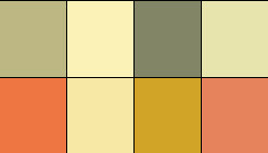
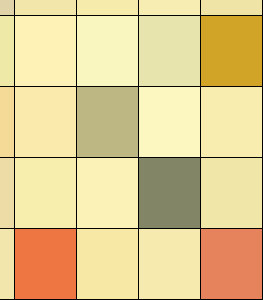
Here is my result
I used the 6 middle colours on the left side of my 16 colour palette


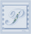
Here is a blank palette for you
Just open it in your workspace copy it and close the original
Now as you choose your colours you can flood them into your blocks.
Save your colour palettes as .jpg images and save them in your work in progress (kit) folder or class folder - you can then open your palette up in your psp work space and use it to refer back to while you are working on creating your kit.
I hope this is helpful to you
Now there are many ways to do something if you know how and following my post today I have had a few interesting alternatives to test.
Thankyou Patrick for sharing this interesting link
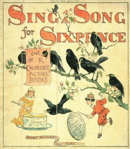
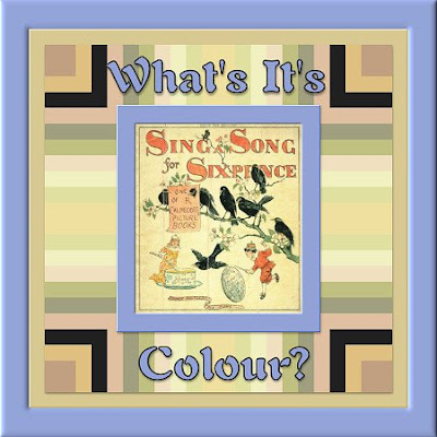
http://whatsitscolor.com/- this was way too much fun!
I never imagined that one of my favourite shades of blue
was the complimentary colour to this little image that I have been testing
with all the colour palette tricks today!
This is really a fun way to quickly sort colours for a kit!
Complimentary Dominant average colour on frame #92a2d7
Dominant average colour this page background #d8c892
Top 10 of 94 unique colours in the little image are in the patterned background.
Another way to create your colour palette using Toadies -
Thank you TM
Here I used the image again from above.
Made a copy and closed the original
Effects/ Plugins / Toadies / Plain Mosaic 2 / Cell Width and Height both to 61 / Alpha Threshold 0 /Edge/Hard/Soft/Off 0
I hand picked the colours I fancied with the magic wand,
and copied and pasted them onto my palette.